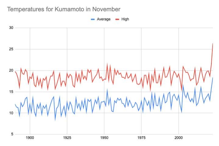
Kirk here feeling rather warm today. Here are a couple of graphs I made with government temperature records to put things in perspective. The average temperatures (in blue) reveal a fairly steady rise while the high temperatures (in red) show this year as a huge jump from the norm. I think it's also interesting to note that the average temperature so far is higher than highs of many years past.
Data source:
https://www.data.jma.go.jp/obd/stats/etrn/view/monthly_s3.php?prec_no=86&block_no=47819&year=&month=&day=&view=a2